Dashboard Customization
There are several ways the Insights Dashboard can be styled and customized to show metrics and ratios for each company.
Insights Dashboard
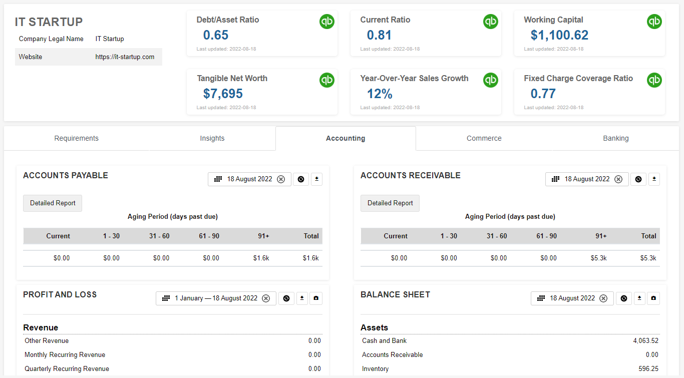
Example insights dashboard showing financial metrics and widgets
Dashboards can be customized via the dashboard-primary.json5 (Lender) and dashboard-customer.json5 (Lender) files located in /private/dashboard/, which can be accessed via WebDAV.
By default, there are four regions on the page that can be customized in the configuration files:
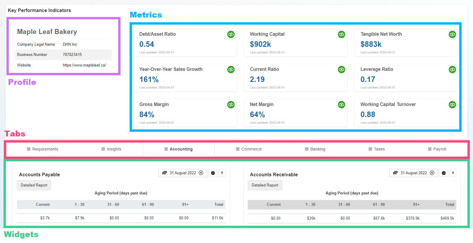
Profile: Customer’s information from the profile form.
Metrics: Custom or default metrics. Please visit Metrics API for a more in-depth view of this including a tutorial on how to create your own custom metrics.
Tabs: What tabs should be displayed in the dashboard.
Widgets: Select the widgets and custom charts to be displayed in each tab and where they should be positioned (by order) and column (left or right). You may view our Widget Catalog.
Check out the https://github.com/boss-insights/kitchen-sink example on GitHub to see a range of possibilities, or start with a minimal template using https://github.com/boss-insights/simple-account
Dashboard Set-Up
You may have multiple dashboards. For example, you may choose to have one dashboard that shows only KPIs and a second dashboard that has multiple tabs containing different widgets.
The dashboards array is set up within the root object in the dashboard-primary.json5 and/or dashboard-customer.json5 file. These can be accessed from /private/dashboard folder of your account’s WebDAV server.
The two slashes inside the objects are for example purposes to display the two objects representing two different dashboards.
 {
    dashboards: [
        {
            //first dashboard object
        },
        {
            //second dashboard object
        }
    ]
}
Within the objects, you can set up the dashboard how you would like. Please see the table and example code below to see.
Keys | Values | Description |
|---|---|---|
key | string | Unique id such as ‘kpi’ or ‘main-dashboard’ |
title | string | The title for your dashboard |
cssClasses | css, i.e. ‘mb-0' = margin-bottom: 0. | The code example below is targeting the title and giving a margin-bottom and margin-top of 0, as well as removing shadow. You can add your own classes or leverage existing ones from Bootstrap. |
hideTabs | true, false | If you would like tabs to be visible or not. Please refer to the image above, the top dashboard has no tabs whereas the bottom has 5. |
tabsets | array of objects | Each object within this array will be a tab. |
{
    dashboards: [
        {
            key: 'kpi',
            title: 'Key Performance Indicators',
            cssClasses: {
                title: 'mb-0 mt-0 no-shadow',
            },
            hideTabs: true,
            tabsets: [
                      ...
                    ],
                }
            ]
        },
        {
            key: 'main-dashboard',
            cssClasses: {
                dashboard: 'mt-2',
            },
            tabsets: [
                      ...
            ]
        }
    ]
}
Tabs Set-Up
Each dashboard component can have tabs such as “Accounting”, 'Insights” and more. These tabs can contain widgets and other information. Details on setting up tabs follow below.
Tabset Keys
Tabset Keys | Value | Description |
|---|---|---|
id | string | Please see Tab IDs table below. |
title | string | The title that appears on the tab in the dashboard |
active | true, false | Can be set for one tabsets array, this decides the default tab to display on dashboard load. |
icon | string | You may add an icon to appear next to the title. The possible icons can be found on Font Awesome with the Duotone style. Within the tabsets array, you may add a key of “icon” and the value as the name of the second class. In the example below, the value “house” would be paired with the “icon” key.  |
columns | array [#, #] | This column layout follows Bootstrap’s styling. Example value: [3,9]. This means the layout is split into 9 sections and the current tab is occupying 3 of those sections. By default the values are: [6,6]. |
widgets | array of objects | Each object within the array is a separate widget configuration. |
Tab IDs
Tabs must be declared to allow widgets to display. Although the title of each tab may be customized the id must match the table below.
The id for the tabs must match the ones listed below. They are case-sensitive.
Tab/Title | ID |
|---|---|
Accounting |
|
Banking |
|
Commerce |
|
Insights |
|
Payroll |
|
Taxes |
|
Requirements |
|
Profile |
|
Example Tabsets Array
This is an example of what the tabsets array within the object may look like:
To control the order in which tabs display on the dashboard, arrange them accordingly in the JSON file. To set the default tab to display on loading, include active: true for that specific tab. If no default is set, the first tab will be displayed. In the example below, the accounting tab will be the default page.
{
"tabsets": [
                {
                    "id": "profile",
                    "title": "KPI",
                    "active": true,
                    "icon": "square",
                    "columns": [3,9],
                    "widgets": [
                        ...
              ]
          },
}
Widgets Set-Up
For details on setting up widgets please see Widget Configuration.
Example File Configuration
Please visit the bottom of our Widget Configuration page to see a complete file configuration.