Metrics Cards & Charts Configuration
Getting Started
Follow this guide to create and display custom charts.
To display the charts in the dashboard, you must edit the dashboard configuration files (dashboard-primary.json5 and/or dashboard-customer.json5) and with the charts configurations (dashboard-charts.json5). Those can be found in the /private/dashboard folder of your account's WebDAV server.
For more information on how to manage your files through WebDAV, refer to Uploading Files via WebDAV
First, edit the dashboard-charts.json5 configuration file to set up the charts you want to be rendered in the dashboard. Each chart must have an id, so it can be referenced by the dashboard configuration files. The charts defined on dashboard-charts.json5 follow this pattern:
{
  "chart id": {
    title: "My Chart",
    type: "line"
    ...,
    metrics: [
      {
        key: "metric_key"
      },
      ...
    ]
  }
  },
  "other chart id": {
    title: "My Other Chart",
    type: "bar"
    ...,
    metrics: [
      {
        key: "metric_key"
      },
      ...
    ]
  }
}
Examples
In the examples below you will see the settings for a line chart, bar chart, and mixed line/bar chart. We’ve included two sample charts: Earnings and Income/Expense which are also available as widgets under the Accounting tab. Please see Chart Settings on this page for customization and configuration options.
Line Chart
Below is an example of a line chart configuration and display.

{
	"example chart 1": {
		title: "Example Chart 1",
		tab: "commerce",
		type: "line",
		stroke: true,
		tooltip: true,
		dataLabels: true,
		markers: true,
		colorPalette: "palette8",
		metrics: [
			{
				key: "sample_metric_4",
				stroke: {
					dash: 'medium',
					curve: "smooth"
				}
			},
			{
				key: "sample_metric_5",
				stroke: {
					width: "small",
					curve: "stepline"
				},
				markers: {
					shape: "circle",
					size: "medium"
				}
			}
		]
	},
}
Bar Chart
Below is an example of a bar chart configuration and display.
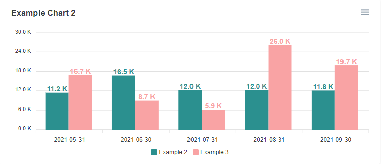
{
	"example chart 2": {
		title: "Example Chart 2",
		tab: "commerce",
		type: "bar",
		stroke: true,
		dataLabels: true,
		metrics: [
			{
				key: "sample_metric_2",
				labels: {
					enabled: true
				}
			},
			{
				key: "sample_metric_3",
				labels: {
					enabled: true
				}
			}
		]
	}
}
Below is a sample of an Earnings chart.
The Earnings chart is also available as a widget for the Accounting tab however; if a dashboard-charts file is created, it must be configured as a custom chart.
.png?inst-v=1180ed29-71ac-43a2-9383-c664da630155)
{
  "earnings": {
          title: "EARNINGS",
          tab: "accounting",
          type: "bar",
          metrics: [
              {
                  key: "net",
              },
              {
                  key: "ebit",
              },
              {
                  key: "ebitda",
              },
          ],
      }
  }
Mixed Bar/Line Chart
Below is an example of a mixed bar/line chart, in this case, it is showing Income/Expenses.
The Income/Expenses chart is also available as a widget for the Accounting tab however; if a dashboard-charts file is created, it must be configured as a custom chart.
.png?inst-v=1180ed29-71ac-43a2-9383-c664da630155)
{
    "income/expenses": {
        title: "INCOME/EXPENSES",
        tab: "accounting",
        type: "line",
        metrics: [
            {
                key: "inflow",
                type: "bar"
            },
            {
                key: "outflow",
                type: "bar"
            },
            {
                key: "net",
            },
        ],
    }
  }
Displaying the Charts
After you’ve finished configuring the charts, you must list them in the dashboard configuration file (dashboard-primary.json5 and/or dashboard-customer.json5) in the widgets object. The widgetsobject expects objects with a key equal to the chart’s id and a value equal to an object containing two configuration variables: chart, which must be set to true, and column that can have "left" or "right" as valid values. For example, to display the two charts configured earlier, they could be configured as below :
widgets: {
"example chart 1" :{ chart: true, column: "left"},
"example chart 2" :{ chart: true, column: "left"},
}
The charts are positioned based on their order within the widgets object ( and the column attribute assigned to them. In the example above, “example chart 1” will be positioned above “example chart 2” in the dashboard’s left column.
Chart Settings
Chart Main Settings
Attribute | Required? | Type | Description |
|---|---|---|---|
| ✔ | string | The title displayed on the chart |
| ✔ | string | Dashboard tab where the chart should be displayed. The value should match the id of the targeted tab as configured in the dashboard configuration file. Possible values: |
| ✔ | string | The type of chart that should be plotted Possible values: |
| ✔ | array | The metrics that should be plotted in the chart. Each metric listed should in an JSON object format:
CODE
|
| object | Sets the text displayed on the left side of the y-axis and its font styling Example:
CODE
| |
| array | An array of two strings (metric keys) used as reference to plot 2 y-axis. The first one listed in the array will be plotted on the left side of the chart and the second one on the right side. Example:
JSON
Note: The chart won’t be rendered if | |
| array | boolean | An array of two strings with the titles that should be displayed beside each of the 2 y-axis declared in the If set to | |
| boolean | Enables or disables tooltip on chart when hovering over series (enabled by default) | |
| boolean | Determines whether to show labels on the metric series or not and enables custom label configurations for a metric series (color) | |
| string | Set the font size of all values displayed on the metric series labels | |
| boolean | Enables markers customization for a metric series (shape and size) | |
| boolean | Enables line stroke configuration on metric series (width, dash and curve) | |
| string | Excel date format to be applied to the x-axis labels (default value is | |
| boolean | Hides reconciliation date annotation displayed on chart | |
| string | Whether the “Reconciled” label will be displayed on the left or right side of the reconciliation data point Possible values:
| |
| string | ApexCharts default color palettes assigned to the chart series. The colors are assigned by the order in which the metrics are listed in the configuration file (e.g. first metric will have the the first color from a palette assigned to it and so on) These can be replaced with a custom colour palette. 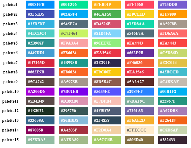 | |
| Object | Allows for ApexCharts configuration syntax for further chart customization Note: Using this attribute in the configuration file will override any non-required attribute configurations. Either use this option to customize your charts or the default configuration attributes |
yaxisConfig Settings
Attribute | Type | Description |
|---|---|---|
| string | The metric name as defined on column A (“Metrics”) of the |
| string | How the series should be plotted in the chart. If not specified, will use the type assigned to the chart as its value. Possible values: |
| Object | Customize the look of the series’ lines. Should be used with at least one of the following properties: |
Metrics Settings
Attribute | Required? | Type | Description |
|---|---|---|---|
| ✔ | string | The metric name as defined on column A (“Metrics”) of the |
|
| string | How the series should be plotted in the chart. If not specified, will use the type assigned to the chart as its value. Possible values: |
| Object | Customize the look of the series’ lines. Should be used with at least one of the following properties: | |
| Object | Configure the markers added to the series' data points in the cart. Should be used with at least one of the following properties: | |
| Object | Allows label configuration for the metric series. For the labels to be displayed for a given series, the
JSON
If set up as an empty object, the label background color will be the same as the one used to plot the metric series. To specify a color, set the | |
| string | Hex color code for the chart’s metric’s series. If a color is assigned to a metric series, it will take precedence over the color palette assigned to the chart and to a color previously assigned to that metric series. |
Metrics Settings - Stroke
Attribute | Type | Description |
|---|---|---|
| string | The width of the metric series (how thick or thin a line is, for example). Possible values: |
| string | Add dashes to the metric series' lines. The values determine the amount of space between the dashes in the series. Possible values: |
| string | Whether the lines draw in the charts connecting the data points should be smooth or straight lines. Possible values:
|
Metrics Settings - Markers
Attribute | Type | Description |
|---|---|---|
| string | How big the marker point is. The default value is Possible values: |
| string | The shape of the marker point. The default value is Possible values: |
Forecasting on Excel Custom Metrics
It is possible to add forecasting data points to one or multiple series on a chart. This is basically a 3-period moving average based on the last there data points available on the series and has been designed mainly for demo purposes (at least for the time being).
Enabling Forecasting
To add forecast data points to a chart:
Add
forecastobject to the chart configuration objectThe aforementioned object must have at least the
periodskey with an integer as its value, which is the number of forecast data points added to the original series.In the metrics array, add the
plotForecastkey to the metric(s) you’d like to forecast and set its value to true.
Example
In the example below, three forecast data points are being added to the gross_sales metric data.
	"example_chart":{
		title:"Sales",
		tab: "accounting",
		type: "bar",
		forecast: {
			periods: 3,
			opacity: 0.5,
			strokeWidth: "small",
			strokeDash: "small"
		},
		metrics: [
			{
				key:"gross_sales",
				plotForecast: true,
			},
			{
				key:"net_sales",
			}
		],
	},
Forecast Parameters
Attribute | Required | Type | Description |
|---|---|---|---|
| ✔ | integer | Number of forecast data points added to the metric series |
| float | Sets the opacity of the forecast line/bar min: 0 max :1 | |
| string | The width of the metric series (how thick or thin a line is, for example). Possible values: | |
| string | The values determine the amount of space between the dashes in the series. Possible values: |