Form Editor
Boss Insights offers an easy to use interface for editing forms called the form editor. It can be found by logging into your Administration Portal.
Please become familiar with the Form Data Model before using the Form Editor.
After you have logged into your Administration Portal, please click “Customer Portal” from the left navigation menu. A new set of navigation links will drop down, from these new links, please click “Form Editor” (Figure 1).
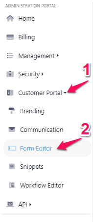
Figure 1. Navigation showing Form Editor link under Developers
Create New Form
You can create a new form by clicking the “Create New Form Button” (Figure 2.1).
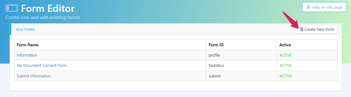
Figure 2.1. Create New Form button
After the button is clicked, the Form Name and Form ID must be created. The form ID will be automatically generated once the Form Name field is filled. The Form ID needs to be unique and cannot be changed once set. Once these fields are filled out, you may click the “Create Form” button in the bottom right (Figure 2.2).
Please note that “profile” is reserved and cannot be used as a form id.
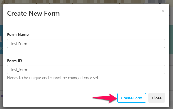
Figure 2.2. Filling out fields for creating a new form
Once the new form is created, you will see a a green confirmation banner at the top of the page. The new form will also appear in the “Your Forms” table on the same page. Now that the new form has been created, you can click it to begin editing (Figure 2.3). Please scroll down to the Edit Existing Form section for more information.
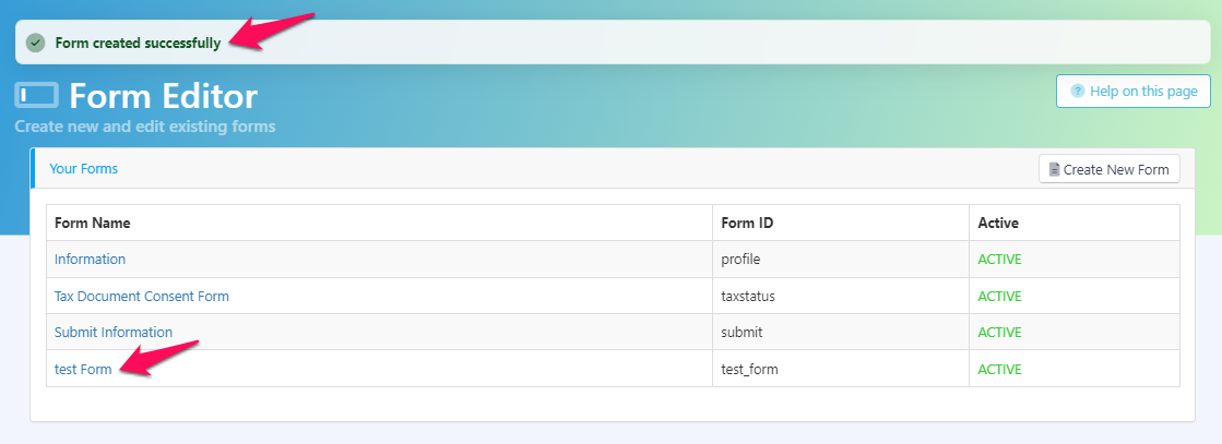
Figure 2.3. Successful creation of a new form
Edit Existing Form
The form editor is a drag and drop system. There is a menu towards the left of the editor containing the different components that can be dragged and dropped into the blank section next to it. You may also click a component to add it to the bottom of a form. The section to left of the component menu is where the form is built (Figure 3.1).
Please note that if this isn’t a new form, there may already be components in this section. If the form is new, this section will be blank.
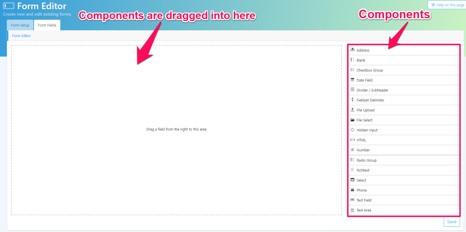
Figure 3.1. Anatomy of the form editor
Your form will not be saved unless you click “Save” in the bottom right corner.
For more details on the components and what they represent, we have a Field Types Table found in our Form Data Model.
Configuring Components
Once a component is added onto the form builder, you can hover over it to see three buttons in the top right. These three buttons are “Remove Element” indicated by an X, “Edit” indicated by a pencil, and “Copy/Duplicate” indicated by two squares (Figure 3.2),
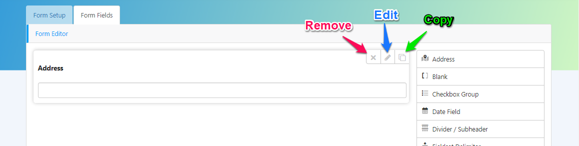
Figure 3.2. Configuration options for components
Editing Components
By clicking the “Edit” button indicated by the pencil icon, you can begin configuring a component. Each component configuration option will be a little different, custom to what it represents.
If you would like to finish editing a component, please click the “Close” button as indicated in Figure 3.3.
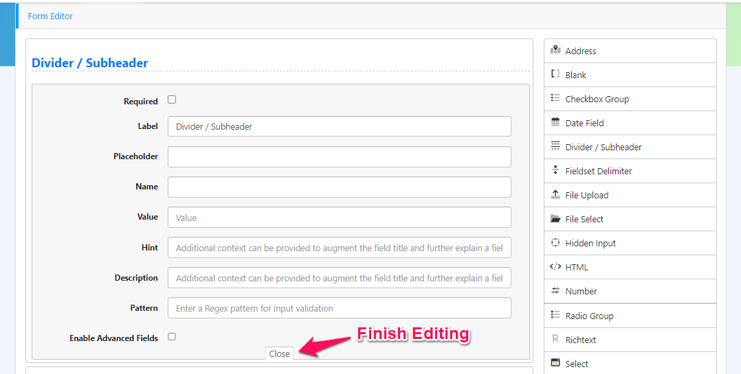
Figure 3.3. Click the “Close” button to finish editing a component
Component Configuration Options
Configuration options that are commonly found can be seen in the table below. For a catalogue of sample configured components please see the Example Configurations for Components section below. You may also visit the Form Data Model for more fields and descriptions.
Field | Description |
|---|---|
Required | Checking this box will determine if this field is required to be filled out by the business or not. |
Label | The title of the field. This is what will be presented to the user. |
Placeholder | A default value will appear here, typically used to provide an example. |
Name | The name is so our software can find this field. It will be filled automatically if the field is clicked after the Label is entered. |
Hint | Additional context can be provided to augment the field title and further explain a field. |
Description | Additional context can be provided to further explain a field |
Pattern | A Regex pattern can be entered for input validation. |
Advanced Options | There are advanced options that can be configured, Clicking this checkbox will make these visible. |
Saving Completed Form
Once you are happy with the form, you can save it by clicking the “Save” button on the bottom right of the screen (Figure 4).
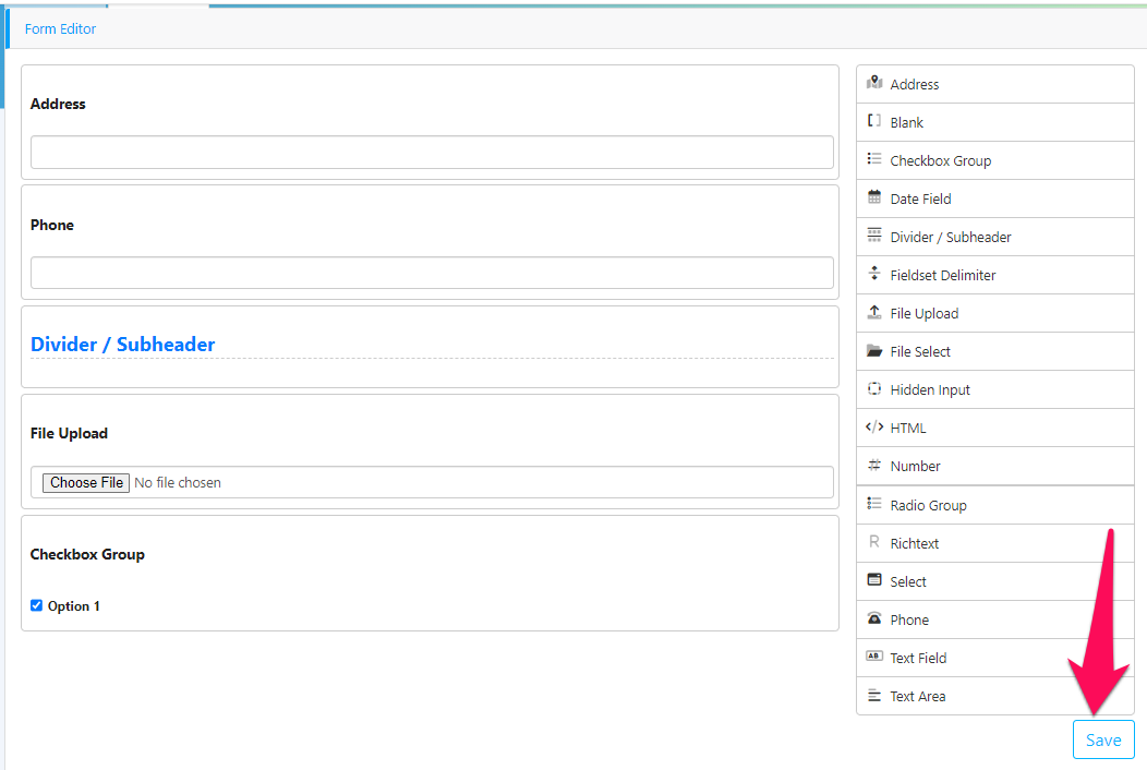
Figure 4. Saving a form
Deactivate Form
While forms cannot be deleted, they can be set to “Inactive”. This can be done by clicking the name of the form you are interested in deactivating. Once the name is clicked, you will be taken to the editing screen. From here, please click the “Form Setup” tab at the top of the editor (Figure 5.1).
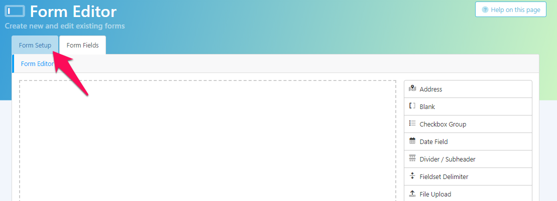
Figure 5.1. Clicking the Form Setup tab
Within the Form Setup tab, you will see the heading, “Inactive?”, if it is set to “No” that means your form is active. To deactivate the form, please click 'Yes” (Figure 5.2).
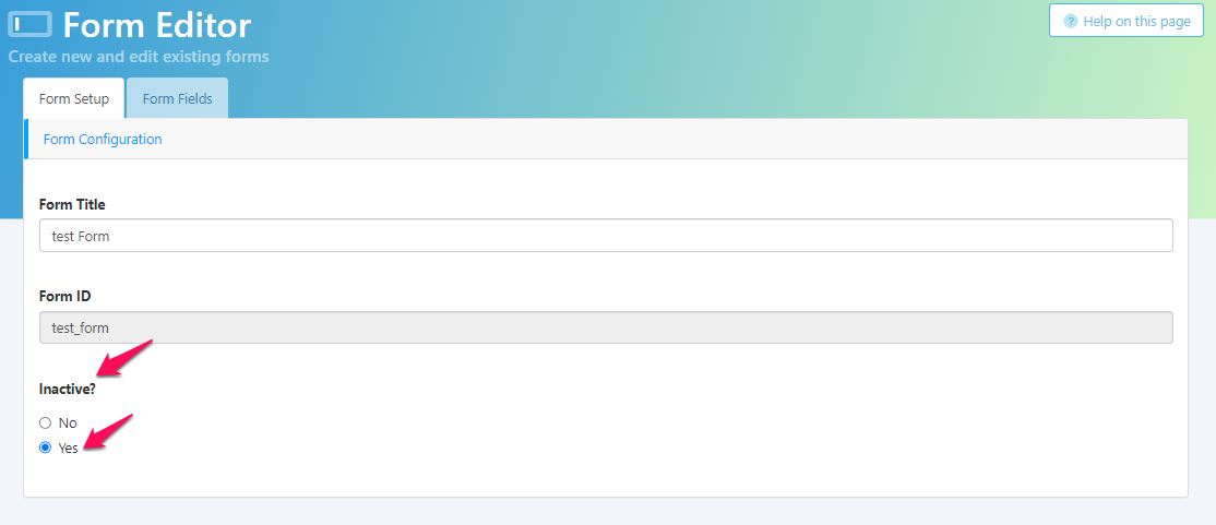
Figure 5.2. Deactivating form
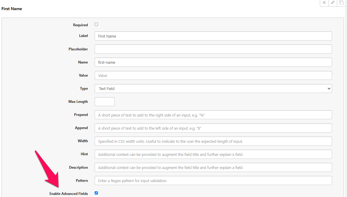
Advanced Fields
Please check the “Enable Advanced Fields” box to view additional options. You may also visit the Form Data Model to learn more about these fields.
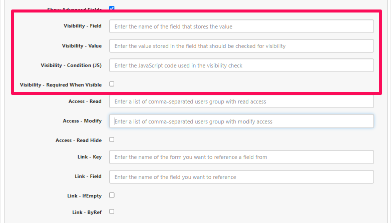
Visibility
The visibility settings are used to configure when or if a field will show up.
Option | Value | Description |
|---|---|---|
Visibility - Field | Field name | This is the name of the field that will be checked. |
Visibility - Value | Desired value | This is the value required in the field above (Visibility - Field) for the current field to be visible. |
Visibility - Condition (JS) | JavaScript expression | A JavaScript expression that evaluates to a Boolean. |
Visibility - Required When Visible | Checked or unchecked | If condition is met and field is visible, it then becomes required. This prevents hidden fields from being required therefore preventing form submission. |
Please note that you can either fill our field and value or condition.
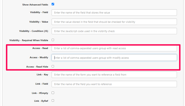
Access
The access settings control which user groups can either read or modify a given field. You can find the available groups you have by visiting your admin portal and then going to Security > Groups from the left navigation menu.
Option | Value | Description |
|---|---|---|
Access - Read | group names separated by commas | Who is able to read the given field. |
Access - Modify | group names separated by commas | Who is able to modify the given field |
Access - Read Hide | Checked or unchecked | When checked, the field is hidden to users with read-only permission. When unchecked, the field is visible to users with read-only permission (still uneditable). |
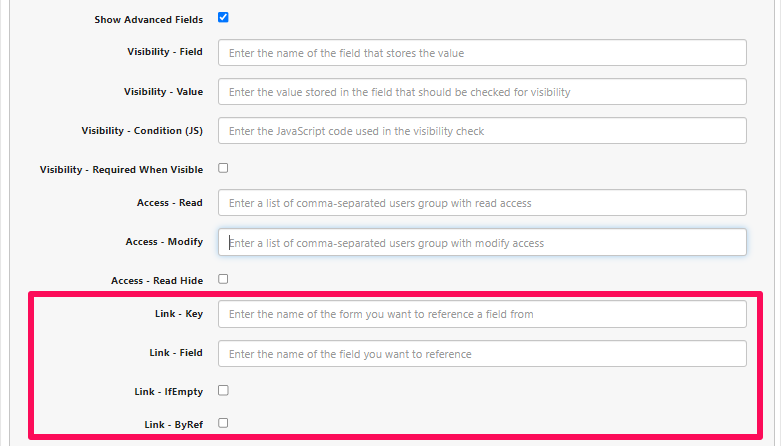
Link
The link settings is for connecting different fields together.
Option | Value | Description |
|---|---|---|
Link - Key | Form ID | You can find the form ID by visiting the form editor page. |
Link - Field | Field name | You can find the field name by editing a form, and then editing a form field/component. |
Link - IfEmpty | Checked or unchecked | When ifEmpty is checked then the link field will only be overwritten if it is empty. If this is checked and the field has an existing value then it will not be overwritten. |
Link - ByRef | Checked or unchecked | When byRef is checked then the value of the current field is always the value of the referred field. |
Sync (Enabling Sync With Form Editor (CRM Integration))
This section will cover using the form editor to allow syncing with CRM integrations. We recommend reading our Configuring Forms For CRM Sync guide for a detailed tutorial on enabling this.
If there is a component that you would like synced with a CRM integration, you can configure this by clicking the edit button, indicated by a pencil when hovering. In this guide, we will be editing a Contacts section.
When the edit button is clicked, you will see a list of possible configurations. In the example below, the form field “First Name” from the Contacts section is being configured.
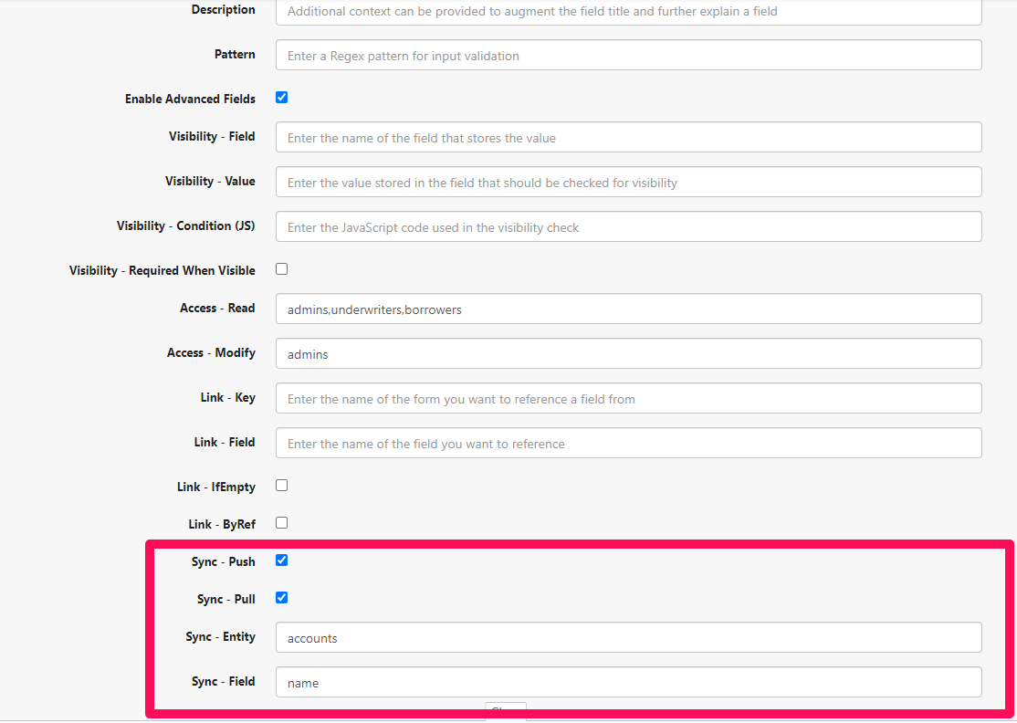
When the box for “Enable Advanced Fields” is checked, there will be four sync options at the bottom of the configuration panel.
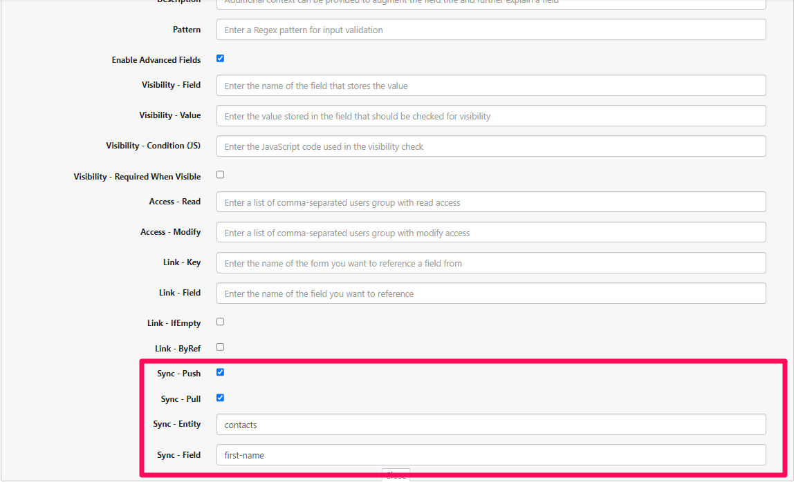
Here, the options that can be configured are: Sync - Push, Sync - Pull, Sync - Entity, and Sync - Field. You may visit the Configuring Forms For CRM Sync for a detailed guide on setup.
Once this is saved, syncs will happen on a daily basis.